Xbox One UI Update E3 2015
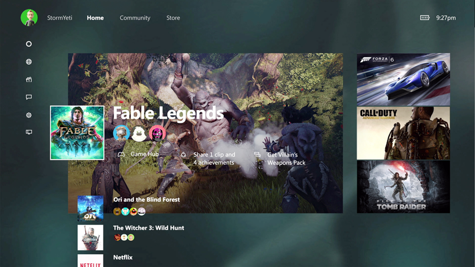
One of the more stranger meetings for me at E3 considering I wasn't there to check out a game, was the Xbox One Fall UI Update. In this behind closed doors meeting with Xbox I was given a number of details about the upcoming Fall 2015 update and what will be changed/added. Now in the traditional sense the Xbox has always been given an update every couple years where everything gets completely revamped. It's hard to believe we're already at that point, though here it's and this new dashboard is quick. That was my biggest complaint along with many others that I talk to and from what I saw this update is all about speed and efficiency. In this article I'm going to do my best to provide some impressions on the demo I saw while there and also some of the finer points that they mentioned while being walked through it. We were also given some time to play with the Xbox One Elite controller though I'll maybe write another article about that or negate it since despite being quite awesome it really doesn't fit into this write-up. When looking at the new UI, which you can see in the screenshots below the first thing you'll notice is that the menu has been swapped out for a vertical scroll system. This is somewhat reminiscent of the old Xbox 360 dashboard which had a similar scheme a few years back. I wasn't particularly a fan of that one despite getting used to it though this seemed fluid and natural for the console. Another big thing for this change is that pins are getting demoted severely which I'm not a fan of, they're available in this same front page though you need to scroll down quite a bit on the main page to find them. It's honestly easier at that point to just talk to the Kinect in order to run a game or even just used the my games and apps. Now, another question everyone will ask is about the store or the my games and apps sections which are currently just dreadful. Sadly we weren't shown anything of the short in that regard so I can't update you on whether those are improved at all. I know, I wish I would have been able to check that area, though from the view of things it certainly looks much improved.

Some other things to note is the potential ad space to the right there and that community tab. That tab will be a new version of the newsfeed which is greatly improved and more focused on actual social aspects, not just a chain of achievement unlocks. Game hubs are also placed with higher regard and more accessible, it's a haven for developers to post updates. That was basically the point of which the meeting team was getting across. Recent game are also highly featured where you can scroll down to see whom is playing; check out the game hub, view recent clips/screenshots/achievements or see the latest developer update. This is all clearly visible from the screenshot above, so feel free to take a second to see where these features are laid out as I'm sure this will provide a smoother understanding of the new design and I believe it'll be quicker. In terms of other areas we were really given a brief over view in order to leave time for questions and the elite controller, though I'll talk about the new snap features next.
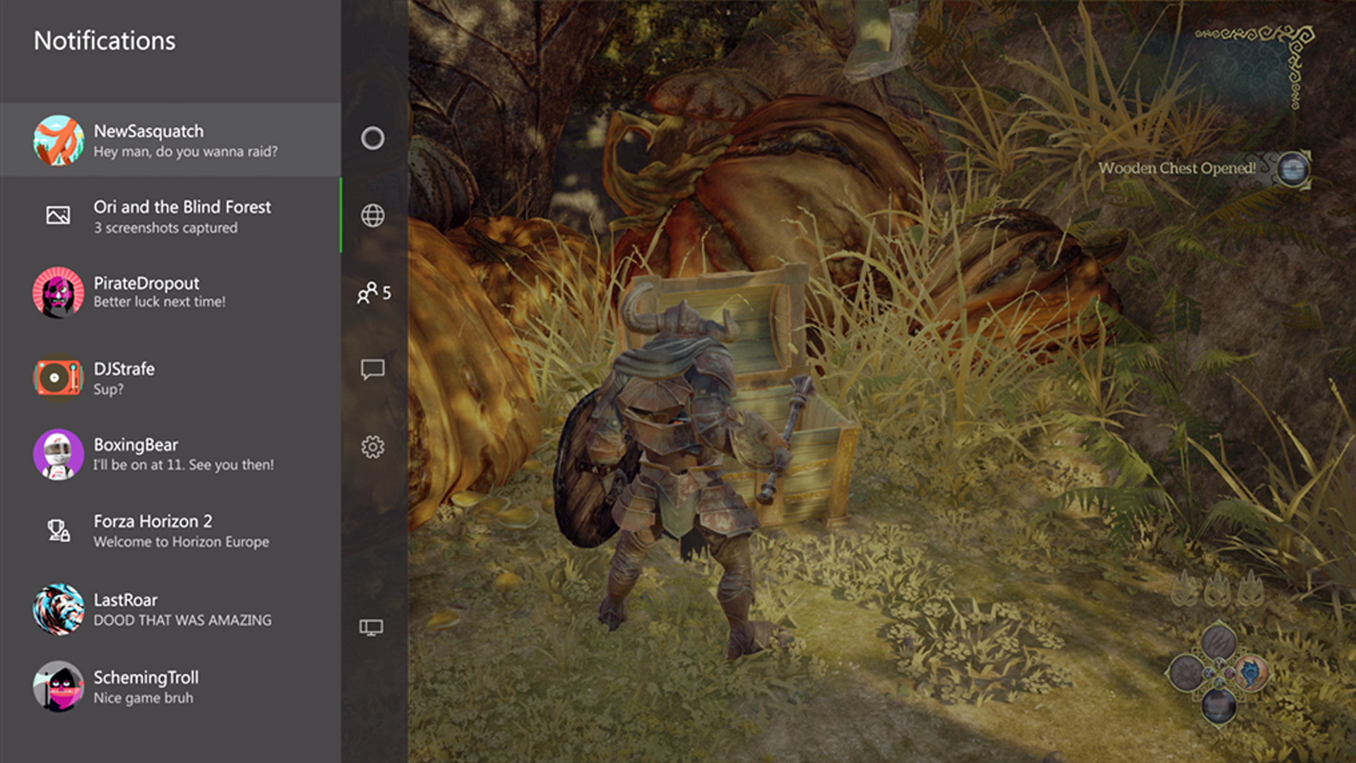
I actually really love the snap feature on Xbox One, it's slow and sluggish though the concept is sound. This new dashboard aims to rebuild it from scratch and give a proper experience this time around. I haven't a clue why they would put it on the left side now since at least my eyes drag to the right always. I also had that discussion with some friends when talking about the new dashboard as well last night, it really doesn't make much sense. Anyways, now as you can see that snap pulls over the game without shrinking the screen and is quick. There's no delay and it doesn't affect what you're currently doing compared to the old one completely disrupting flow. The menus have been all redone with a modern look at least I think so and Cortana has been added. She will only be available in the US and UK which leaves all other markets in the dust. You know, because us Canadians are all weird with our strange accents. Must be real hard to optimize for the country that basically speaks the same language right above you. Though that's enough spieling from me, it might be the French side though I don't see why English speakers don't get to enjoy even a beta version of her. Another thing to notice about the snap is that all the custom color has been removed so it'll be neat to see if they at least allow us to tweak the opac black icon area. I also wonder how custom backgrounds will work for the new dash and our custom colors schemes, it'll be neat to see those in play with this one.

Aside from the new UI and the elite controller we also went over details of the Xbox 360 emulation. I'm not going to go over that again and I'm sure everyone is well versed with how it works. Emulates Xbox 360 on Xbox One digitally or with disc, DLC has to be accepted by the developer along with the games themselves. They're also looking at other games that might have been left in the dust like THQ titles, though you can go over to uservoice in order to vote. Final things to mention from my notes are that avatars are making a comeback with fancier designs integrated. The UI has a core focus on speed and intelligence when gamers are using it. Also there's apparently hotkeys to make your movement through the dashboard much more efficient. It certainly looks wonderful and I can't wait to actually get the full preview version when it becomes available closer to Fall 2015. If you have any questions let me know and follow the site for other updates.
All E3 2015 Coverage

 Xbox
Xbox Playstation
 Nintendo
 PC
PC Mobile


